Chinese Mobile App UI Trends

This summer, I packed up all my things and moved from San Francisco to Guangzhou, China for work. Through an unlikely chain of coincidences that I don’t entirely recall, I’ve become a product manager on WeChat, a popular messaging app in China.
Moving to a new country has meant learning how to do lots of things differently: speaking a new language, eating, shopping, getting around. In a few months, I’m surprised at how acclimated I’ve become to what, at first, seemed such an overwhelmingly alien place.
This has applied to my digital life too. I’ve replaced all my apps with those used here, owning both to my keen interest as someone in the tech industry, and to “go native” to the extent I can. Since then, I’ve similarly become blind to the adaptations required there, too.
One day, for the fun of it, I started writing a list in my notebook of all the things that are different between apps here and those I’m accustomed to using and creating back in the US. When I finished, I was surprised by how long the list was, so it seemed fitting to flesh it out into a post.
Table of Contents
- Input is Hard
- Indeterminate Badges
- Walled Gardens, Portals, Platforms
- Accounts and Login Screens
- Chat as Universal UI
- Buying Stuff
- Location, Location, Location
- Everything Can Be Downloaded
- A Word on Moments
- Miscellanea
- Footnotes
Input Is Hard
PINYIN FUZZY MATCHING
People here use myriad methods of typing Chinese characters: everything from Pinyin, to tracing characters by hand, to a stroke-organized keypad, even one emulating older cell phones’ numeric keypads. The method one prefers seems to depend largely on the era and region one grew up in, though Pinyin seems the most popular.
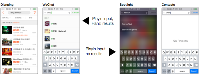
Yet sites and apps here do not require using of any of these. They’ll happily accept Latin characters as search terms and resolve them to Chinese-language results — independent of your operating system. They even use heuristics to interpret typos and homophones. Once you’re used to it, it’s annoying that the OS and most other apps don’t work this way.
While apps have gone to great lengths to handle all sorts of Chinese input, it’s no surprise that they seldom implement good fuzzy matching for English (e.g. stemming, soundex, gracefully handling diacritical marks, punctuation, and capitalization).
VOICE MESSAGES, VOICE SEARCH, VOICE AGENTS
Why make typing smoother when you can avoid it altogether?
Voice messages in chat apps (particularly WeChat) are popular here. They save the hassle of typing, and can be a godsend for for older generations who have little proficiency with computers, much less any muscle memory for the various methods of inputting Chinese characters.
Personally, I always feel slightly inconvenienced when I receive voice messages, as I must stop what I’m doing to listen (instead of skim over it). I also feel awkward about replying by voice, particularly in public (for fear of being “Bluetooth headset-guy”).
But people here clearly don’t feel the same way, as it’s easy to witness many in public places sending voice messages. The typical pose is holding the phone microphone to the mouth at a slight angle while pressing down on the “record” button with the thumb.
Voice search is also widely supported across apps. In a recent interview, Baidu’s Andrew Ng noted that 10% of their searches were made by voice input.
QR CODES FOR EVERYTHING
Before I shipped out, I conducted user research interviews in San Francisco to gather insight on US users’ habits and preferences. At one point in each interview, I showed the subject a QR code and asked them what it was.
“Isn’t it, like, you take a picture and it brings you to a mystery website?”, scoffed one college girl. Another said they took a photo of one (using the Camera app), to no apparent effect, and never tried it again1. “I think they’re for coupons or something”, a few surmised, often adding they were a bit afraid of what it might do to their phone. I taped these buffudled reactions to show to my coworkers to further underscore the point that QR codes never took off in the US.2
The Chinese, as you’d guess, are no stranger to them. QR codes are printed on most ads, brochures, restaurant menus, business cards, yes, coupons, and even on the backs of train seats and restroom stall doors:

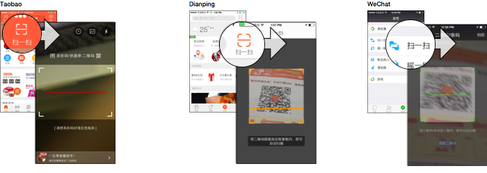
Most apps have their own QR code reader feature built-in. The codes you find printed on things sometimes only work in one app, so often there will be a row of QR codes for WeChat, Weibo, and other apps. They contain URLs, as one would expect, but not always ones that can deep-link into the app if scanned in an external reader.
As I’ll describe later, these codes are used for everything from, yes, marketing websites, but also for useful things like adding people you meet in real life to your contacts, paying for things, and logging into sites.
Indeterminate Badges
Apps in China liberally employ a UI element best described as the “indeterminate badge”. It’s not possible with native UI controls on iOS, and I’ve seen no US apps use them3.
These are just the standard red badges you’re used to, but with no number. They’re used at every point in an app’s menu hierarchy, cascading, ending with the bottom tabs. If you haven’t opened an app in a little while, you’ll find more than a few screens sequined with these.
Indeterminate badges indicate:
A. New content has been loaded here, somewhere beneath the badged UI element. It indicates that the new items require no action from the user, or that the exact number doesn’t matter. This is used for social media news feeds as well as streams of new items on movie, music, or ecommerce apps
B. A new feature is available. When you find it, it will have a red “NEW”/”新” next to it.
C. The user has turned off or subdued notifications for part of an app. For instance, one can mute a chat in WeChat, which supplants its numbered badge with an indeterminate one when new messages have been sent to the chat. 4
Apps employ both numbered and indeterminate badges. If a UI element has children displaying both types, the numbered one takes precedence and gets displayed on the parent.
It strikes me as an invention of necessity, as more complex menu hierarchies require thoughtful means of guiding the user to plunge their depths. It also heightens the addictiveness of many apps, in instances where so many numbered badges would just be too in-your-face.
Fun fact: In QQ, you can drag any numbered badge (but not indeterminate ones) and it’ll come unstuck from its parent UI element and disappear in a little puff of smoke.
Walled Gardens, Portals, Platforms
Richard Gabriel’s The Rise Of “Worse is Better”, now a classic essay, was the first to draw a distinction between two opposing views on software design:
There’s the “Worse is Better” approach exemplified by UNIX and C as developed at Bell Labs. It leans towards collections of small, somewhat crude, interoperable tools. Then there’s the “The Right Thing”/”Better is Better” approach, exemplified by Common Lisp, Scheme, and Emacs as developed at MIT. This approach produces larger, more comprehensive, monolithic solutions to problems.
The latest trend in US apps is splitting apps into “constellations” of ever-more-focused and minimalist task-driven apps, in a nod towards the “worse is better” school. But apps here have been tugged in the opposite direction.
Every app has accumulated more and more features seemingly unrelated to their ostensible purpose — sometimes cleverly integrated, sometimes strapped on arbitrarily — in what I can only imagine are bids to make each app retain eyeballs and work its way into more users’ daily habits.
A few examples that come to mind:
-
WeChat is the emacs to WhatsApp’s vim. Besides messaging, it does and video calls, has a news feed, a wallet with a payments service, a Favorites feature functioning more like Evernote, a game center (with a built-in game), a location-based people finder, a Shazaam-like song-matching service, and, in accordance with Zawinski’s Law, a mail client5. Its official accounts platform (described later) goes as far as providing a layer to allow hardware devices to use the app to communicate with services, instead of requiring custom apps.
-
Baidu Maps has weather, an optional “Find My Friends” feature, travel guides, a full “wallet” mode for buying all kinds of things. Tencent Maps lets you send audio postcards. Both have QR code readers and obligatory Groupon-style local offers.
-
Weibo, once a Twitter analog, does much more. Its “post” button actually allows one to post up to 10 distinct types of content, from blog entry to restaurant review. It, too, has grown a wallet feature.
-
While all-encompassing, Yahoo-like “portal” homepages died in the US sometime in the early 2000’s, they’ve had a long life here in sites like Sina, 163.com, hao123, and Tencent News. Though “normal” apps have all sprouted portal-like features, the actual portal sites all have apps of their own which seem popular enough.
##### “DISCOVER” IS THE NEW HAMBURGER MENU
US apps have standardized on a few ways to group their non-categorizable odds-and-ends (things like settings and help). Often they’re under a “More” tab on the far right (with an elipsis icon), under the dreaded hamburger menu, or, in Facebook’s case, under a “More” tab with a hamburger menu icon.
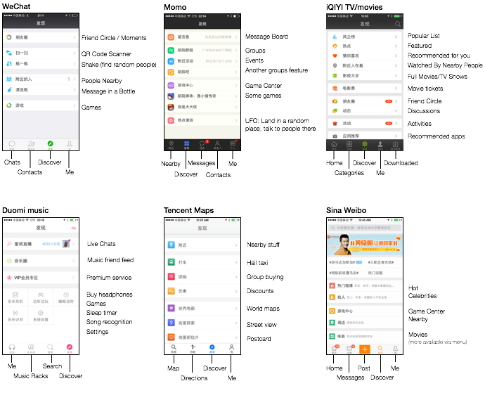
Chinese apps sometimes do likewise, using “更多” (gèng duō, “even more”). But more often than not, they’re in a second or third bottom tab, emblazoned with “发现” (fāxiàn, “discover”). The Discover menu houses a changing menagerie of fun, not-quite-essential extras that augment the core function of the app. The icon of choice is typically a compass.
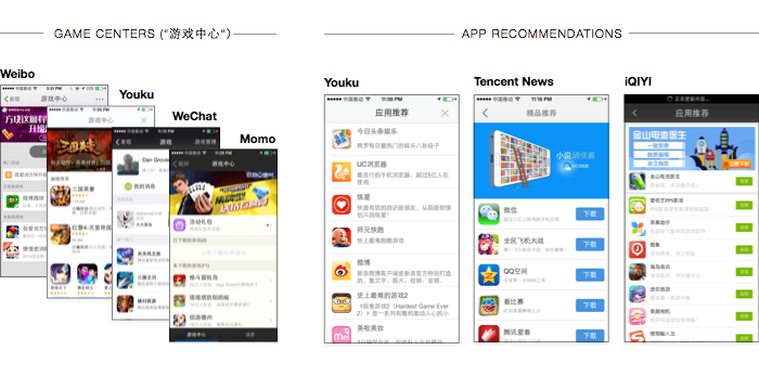
Lots of apps have a screen promoting other apps to download — typically games, but often other apps as well. Sometimes these screens link to the iOS app store, other times circumventing the app store with an OTA install. Entire third-party app stores using this method are also promoted within some popular apps.
On Android, there are over 10 big app stores, and releasing an app requires listing and updating it on each. Even on iOS, there are alternative stores — I see ads for one called 苹果助手 (Apple Helper), which requires installing a custom provisioning profile to use. Cydia is still popular, too, as jailbroken iPhones abound.
Accounts and Login Screens
PHONE NUMBERS AND TOKENS OVER PASSWORDS
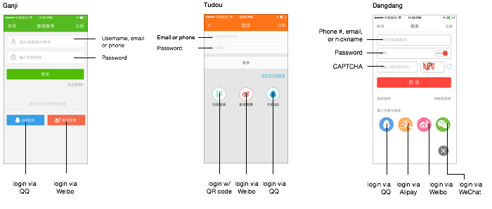
US sites and apps typically allow two methods of logging in 1) a traditional email and password or 2) third-party authentication through Facebook or Google.
These days, of course, we’re also used to confirming our phone number in messaging apps and in whatever spinoff social app du jour Facebook’s come out with. You key in your number and receive a confirmation code via SMS.
But here, all apps offer this type of phone number registration/login (if not prefer it). This also applies to websites, even those without apps.
QR CODE LOGINS
Many sites also allow users to log in by scanning a QR code in the site’s own app. In the QR code is an expiring session identifier that, once read by the mobile app, associates that browser session with the logged-in account.
This is ideal for situations when you don’t want the user entering their password with an actual keyboard. I’ve been told that in the past, many people used online services on public computers in places like internet cafes which can be plagued with keyloggers and spyware.
Many apps do also offer third-party authentication through WeChat, QQ, Sina Weibo, or sometimes Renren. On a phone, it’ll switch to the respective app. On websites, you get a choice of either a traditional login or scanning a QR code with the third-party service’s mobile app.
MORE SECURITY MEASURES
Bank sites (as well as Alipay) require a special browser plugin implementing their own password fields. My bank even gave me a USB thumbdrive containing some kind of crypto key. I’m not sure what to do with it, other than hide it.
Often, login screens require completing a CAPTCHA, far more consistently than US apps and sites, which typically only use them on registration forms. Some mobile apps even have them.
Chat as Universal UI
OFFICIAL ACCOUNTS
WeChat has popularized the concept of “official accounts” for brands and public figures. They’re kind of like the IRC and AIM bots of yore — think SmarterChild but for banks, phone companies, blogs, hospitals, malls, and government agencies. Many institutions that otherwise would have native apps or mobile sites have opted instead for official accounts.
You can send any kind of message (text, image, voice, etc), and they’ll reply, either in an automated fashion or by routing it to a human somewhere. The interface is exactly the same as for chatting with your friends, save for one difference: it has menus at the bottom with shortcuts to the main features of the account (though it can be toggled away to reveal the normal text field).
Other than that, every feature you can use in a normal chat is available here. WeChat even auto-transcribes the voice messages (mentioned before) into text before passing them to the third-party server running the account.
Official accounts can also push news updates to their subscribers. Every media outlet operates one, making the screen where these accounts live much akin to an RSS reader for many users.
The success of this model has led to many apps appropriating chat-style UI in different ways. Sina Weibo naturally uses it in their own official accounts feature, and as does QQ. But it can also be found in the “customer support center” area of many other apps). A startup called Grata even sells a white-label version of this that can be dropped into any app.
App makers haven’t just seized upon some insight that a familiar chat-style UI would make sense. They’ve actually copied the entire UI, lock, stock, and barrel, down to the layout of the three-tabbed bottom menu and of the “rich media” news messages pushed to subscribers.
EMOTICONS AND STICKERS
Before the mass-adoption of emojis, the smileys available in most Western apps were direct graphical equivalents of traditional text emoticons, with perhaps 15 or so in common use.
But here, QQ long ago set the standard for graphical emoticons. Its set of 80-someodd icons is wonderfully expressive and versatile, even compared to emojis. The icons in the set range from basic emotions to odder ones like  ,
,  , and
, and  — each one with a fitting time and place!
Any app offering chat features here would be remiss to not copy them, and indeed QQ’s emoticons were carried forward to WeChat and “borrowed” by many, many other apps.
Including larger, animated stickers is also obligatory — though, contrary to my expectations, it doesn’t seem like people in Asia are that more sticker-crazy than people in the US.6
Buying Stuff
Online payments in China had a bit of a rocky start due to, well, the complexities of working with Chinese banks. Websites here, instead of just taking a credit card number, require the user to choose their bank from a list of thirty or so, and fill out a form to bind the account. Each bank apparently offers its own unique point of integration that each website must support. This was quickly abstracted into third-party payment solutions like Tenpay and Alipay that were adopted widely by websites here.
SINGLE-SIGN-ON MOBILE PAYMENTS
Now many mobile apps can link with your bank account and be used as an intermediary for other apps, freeing you of going through the onerous binding process in yet another app.
The only time I’ve seen this in a US app was once when I was able to use Venmo to pay for a hotel room on Hotel Tonight. I had been stranded in an airport and was so delighted to see it as an option that I booked the room right then, rather than peruse other options that might require me to enter my credit card information.
But here, this goes without saying. The key difference is that the user doesn’t have to download some weird extra wallet/payments app — the wallets are built into apps they already have.
EVERY APP HAS A WALLET
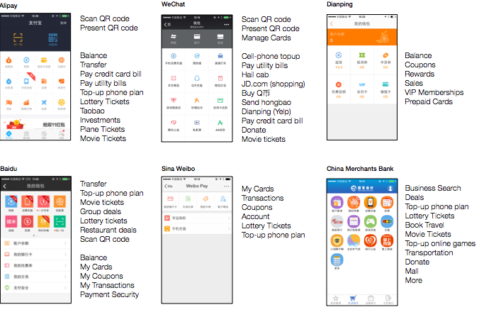
The management functionality around payments is organized into a central screen, usually called 钱包(qiánbāo, “Wallet”). In addition, these screens have buttons to:
- Buy things elsewhere in the app that would naturally come up (e.g. buying an offer in a local offers app).
- Buy things in real life by scanning a QR code displayed at the point-of-sale. Or vice versa — you can also have your phone show a QR code which is then read by a camera at the point-of-sale (which is a tad faster).
- Send payments to friends, usually called 红包 (hóngbāo, the traditional red envelope used to give gifts of money in China).
- Buy things that have nothing to do with anything. For instance, most apps with this feature offer plane tickets, lottery tickets, movie tickets, an Uber-like service to hail cabs (e.g. Dididache), a way to recharge your pre-paid cell phone service, and a way to pay your utility bills. Tencent’s apps have a mini-version of JD.com (a partner e-commerce site), as well as a way to buy QQ币,their virtual currency.
Most of the apps with wallets use very similar layouts with a 3-column grid of colorful icons, typically representing the same collection of functions. Even my actual bank’s app has a screen like this, allowing you to buy things with your balance.
DUDE, TRUST ME, I HAVE A SHIELD, OKAY?
Any app touching money makes enormous pains in promising the security of the transaction. They often have a “security center” screen, which uses a giant shield icon somewhere. US ecommerce sites, of course, did similar things until the early 2000’s (remember “Hacker Safe?”), and today make such promises more subtly.
There are also a few popular apps that are supposed to somehow make your phone run faster, free up memory, make it more secure, and perhaps rid it of snakes. They’re superficially reminiscent of those made for Windows XP at its nadir of malware issues. Of course, this kind of app is useless on your phone, but — just so you know it’s the real deal — they’ve got big shields.
Location, Location, Location
Apps here are never shy about asking for permission to retrieve your location, and they usually find some way to use it when you look hard enough — whether it’s auto-filling a “choose your city” dropdown, showing the weather, or to populate a “local offers” screen.
Many apps also let you connect with strangers nearby, which, here, is not creepy at all. The idea’s been tried in the US with apps like Highlight and Skout, but they have never had the degree of mainstream success that the category has enjoyed here. This could be due to differing cultural attitudes, or a simple function of population density and urbanisation. But it’s a widely-used and widely-implemented idea here.
AS A STANDALONE CATEGORY
Momo, one app expressly built for this purpose, has over 60 million monthly active users and has already filed for IPO. It lets you meet people near you, but also find events, discussions, games, and more. Weiju and Bilin are other contenders in this category.
BUILT INTO EVERYDAY APPS
Aside from the popularity of these standalone apps, more remarkable still is that every normal, seemingly more utilitarian app also includes such features.
WeChat and QQ, the two most popular messaging apps, have a “People Nearby” feature giving you a simple list of people near you, often also letting you browse the photos they have posted to their news feeds. It’s opt-in, of course — you appear on the list of people nearby and are contactable for a couple hours by virtue of looking at the list yourself.7
Weibo, unlike Twitter, lets you see posts near you, as well as popular accounts and groups. And the major music, movie, and TV apps even show you what media people near you are watching and listening to.
Also noteworthy is Baidu Maps’ “heatmap”, a live-updated, block-by-block population density map, created by aggregating all the user locations transmitted to the server.
I have the feeling that if mainstream US apps ever added these features — even with a careful and restrained implementation — it’d be instant fodder for scare stories on evening news broadcasts and angry diatribes in the blogosphere by some interest group or another.
Everything Can Be Downloaded
Every app centered around any kind of media allows you to download things for offline consumption. This includes the music apps (QQ Music, Duomi, Baidu Music, etc) and the TV/movie apps (iQIYI, PPTV, Tencent Video, Baidu Video). You’re guaranteed on any subway ride to see at least a dozen people zoned out, catching up on their shows during a commute, something I’d never seen in the US, likely because of users’ ability to download shows here.
Major news apps, too, let you suck down hundreds of articles for later perusal. And every major map app allows you to store offline copies of maps of your city, or even the entire country. The English to Chinese translation apps like Baidu Fanyi and Youdao follow suit, allowing users to download a set of training data for faster (but coarser) offline machine-translations.
Apps that include this functionality highly tout it in their marketing. And when you download a movie or song, you’re usually given a choice of quality setting, and are told exactly how much data and storage is used, down to the KB, in instances where US apps would reduce it to a progress bar or omit it entirely. Often times, they give you a graph of your total disk usage as well.
A Word on Moments
It’s worth breaking from general trends to call special attention to the design of WeChat’s “Moments” or “Friend Circle” feature.
When I first saw it, it seemed as if someone hastily duct-taped an ersatz Facebook news feed to the app and slapped the Picassa icon on it. But as I’ve used it, I’ve found it a surprisingly original and subversive feature. In fact, it’s everything Facebook’s news feed isn’t:
No filtering — Every one of your friends’ posts is here, with no filtering or re-ordering. If one of your friends is annoying, you can take them off the feed, but it’s an all-or-nothing deal.
More intimate — When you like or comment on a friend’s post, only they and any mutual friends can see it – not all of both parties’ friends, as on Facebook. This means that only the author of a post has an accurate idea how many people liked or commented on their post. This lowers’ users inhibitions in engaging with their friends’ posts.
No companies/news — When you follow a company or news site’s official account, they push their updates in a separate area, not on your news feed. Though a friend can re-post content from these accounts to Moments, it takes some deliberate action.
No auto-posts — Third-party apps can post to Moments, but only if the user initiates it, gets switched into WeChat, and manually confirms the post, each time.
No games — Tencent makes boatloads of money off of Zynga-style social media games. However, they’ve had the good sense to relegate this activity to a “Game Center” section of the app that can be safely ignored.
No photo filters - Though many types of content can be posted to Moments, it’s biased towards photos. Moments also actively eschews Instagram-style filters, in an attempt to make posts fast, spontaneous, and raw.
As a result of these design decisions, and the way it’s sewn into the parent app, people here are addicted to checking this feed, more than any other. To switch between messaging to checking the feed, to commenting and engaging, and back is a swift and fluid movement that people perform countless times each day.
Miscellanea
ASSISTIVE TOUCH
Probably half of all iPhone users I see have the “Assistive Touch” option turned on, which makes a floating button appear on your screen at all times. This button, besides being annoying, emulates the hardware “home” button, as well as multitouch gestures for users whose impairments prevent them from performing them.
Nobody can give me a straight answer on why they, a person with two functioning hands and a full complement of motor neurons, enabled this obscure accessibility setting. Answers range from protecting their investment on the phone by not wearing out the physical home button, to it just being fun to play with when you’re bored.
CUTESY MASCOTS
I see a lot of cutesy mascots, often shown in loading and error screens.
POLLUTION WIDGETS
Some apps include quick ways of keeping tabs on local pollution levels.
AD SPLASH SCREENS
Quite a few apps show full-screen ads when you start them. You don’t have to wait for them to load — they’re typically pre-loaded in the background, or even baked into the app. Sometimes they’re for content/items available for purchase inside the app, or for a special event or promotion. Other times they’re unrelated, the same sort of ads you’d see on billboards or on the subway.
THEMING
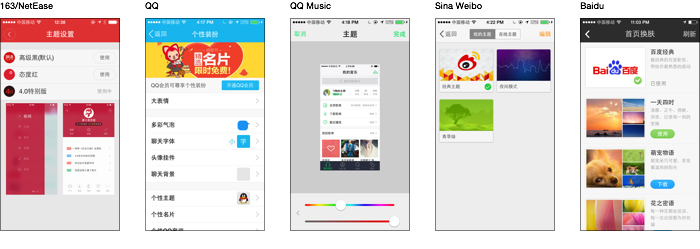
There’s clearly a trend of major apps offering ways to theme/skin them. I can’t seem to think of a single US app I use on iOS that has this.
ANDROID ROMS
In a place where Google is blocked anyway, people don’t get much value out of the lily-white, unadulterated Google experience that Nexus devices offer, and the stock OS distribution on phones are as terrible here as anywhere. To fill that void, a few alternative Android OS distributions have emerged, including Xiaomi’s MiUI, Alibaba’s YunOS, and Smartisan.
They’re all quite polished and have their share of original UI ideas, but I haven’t had enough time with my Android device to make full notes (perhaps a topic for a future post). I do highly recommend watching Smartisan’s launch event (English subtitles), if only for the entertainment value.
ACKNOWLEDGEMENTS
Thanks to Ray, Andrew, Alex from AppSocial.ly, Zach Xiong, and Andrew Badr for revisions on this post.
FOOTNOTES
-
After seeing Facebook Rooms’ implementation of QR Codes (wherein the app scans your photos/screenshots upon launch for any QR codes), I suspect they interviewed the same people in studies they conducted. Of course, they could have also asked “If a mobile user encounters a QR code on a page somewhere, what the heck are they supposed to do with it?” ↩
-
Several friends here have pointed out that QR codes were a joke in China, too, until around 2011. They credit WeChat with legitimizing the concept. ↩
-
The Twitter app is a notable exception. Showing much restraint, it uses but a single indeterminate badge for the main feed on the first tab. ↩
-
Many official accounts are restricted to only displaying this type of notification. ↩
-
QQ Mail users can view their mailbox in the app. ↩
-
One difference between stickers as realized by Facebook and Path and as by Asian apps like WeChat and LINE is that the latter have user-generated stickers. Stickers can be generated by third-party apps (and in LINE’s case, official accounts), then passed around. Many of the ones I see on WeChat are similar in character to the /r/gifs section of Reddit. ↩
-
There is a bit of a spam problem, as many of the accounts on the feature are prostitutes and people selling stuff (usually weird cosmetics or vitamins). But it can indeed be used to meet people. And regular folks who wouldn’t install a standalone app for this do check the “nearby” list from time to time, especially when they’re bored. ↩

