More Chinese Mobile UI Trends

At the end of 2014, I wrote about the trends I noticed in UI design in apps in China. It was a surprising hit, receiving hundreds of thousands unique views the following week, and multiple translations into Chinese as well as Russian and Korean.
I’m not sure why it struck a nerve. To my buddies back in SF who thought I was nuts for shipping out here, maybe it was interesting to see how software makers in China are far from being mere hawkers of pale, tasteless knockoffs forced onto the unsuspecting public living behind the Firewall. Rather, it’s a vibrant, thriving scene here, filled with talented people whose work reflects a different set of ideas, priorities, and sensibilities.
To others, perhaps another angle was trying to use a society’s software as window into its values and culture — something few other countries’ domestic software output is voluminous enough to enable.
As to the surprising number of people in the Chinese blogosphere that translated, reposted, and analyzed it, I guess the appeal was that no outsider had ever before really looked at the design of apps here as being that different at all.
This being 2016, the year of the Monkey, it’s about time for a new installment. I’ll start with some more tidbits on app design here that I hadn’t noticed when I wrote the last article, then move on to some new developments in the mobile world since then.
Things I Hadn’t Noticed Before
USER RANKS
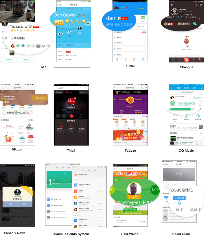
Long a feature of the PhpBB-style forums of my youth, then promptly dispensed with once the “social web” properly took off in the mid-aughts, user ranks are quite common in Chinese apps. In social apps, they’re a 等级 (děngjí, grade) while in e-commerce apps, they’re points 积分 (jīfēn, points). They’re denoted next to one’s profile name as a series of badges, or as a special border on one’s avatar. Often starting a “VIP” membership in a premium app will add a special icon next to your name.
I’m told QQ was the first to do this, basing their rank system on hours connected. People once left their desktop PCs running to rack up the hours, until a daily cap was added.
I don’t really use QQ much, but my profile has more medals than a NATO general’s uniform. Weibo says I’m a level 9; maybe at 10, I can finally cast “magic missile.”
THE “BULLET CURTAIN”
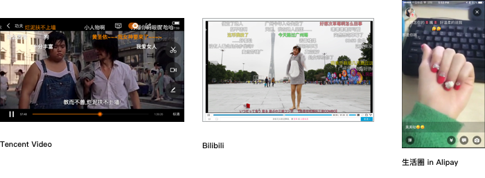
Originating from Japan, many Chinese video sites and apps have a button that displays users’ comments chaotically scrolling marquee-style over the video. This is called 弹幕 (dàn mù).
SOME ICONS I’VE ONLY SEEN HERE
I’d mentioned before that tons of apps offer theme options. I hadn’t noticed then that most had settled on the same, curious icon to represent this: a T-shirt. I guess it makes sense, it’s like new snazzy new threads for your UI. A few buck this trend by using a paintbrush icon instead.
Another funny one is the “happy shopping bag”, used for shopping features1. Many apps have some kind of store — whether it’s jogging apps selling gear, music apps selling headphones, WeChat and QQ selling you top picks from JD.com, or, well, any product from Xiaomi trying to sell you more Xiaomi products.
KEYBOARDS & RETURN BUTTONS
The iOS SDK allows developers to choose what the button in the lower right of a keyboard does. Is it a gray “return” button that inserts a line break, or is it a bright blue button with an action like “Search” or “Go” or “Send”?
Without looking, if you were designing a messaging app, which would you choose? Is it important to allow the user to insert line breaks for things like lists and multi-paragraph letters (in which case you need to add a custom “send” button somewhere in your UI outside the keyboard), or would you just pop a blue send button on the keyboard? It seems like a clear win for the latter. How often do you really need line breaks when typing an SMS on your phone, right? And wouldn’t users accidentally add a line break when they mean to send the message?
No! Wrong! It turns out when you make that your send button, it’s easy to accidentally hit it while typing a space and send an incomplete message or one with an incorrect autocompleted word. So easy, in fact, that the iOS system Messages app and every Western-produced chat app under the sun has unanimously elected for a custom “send” button outside the keyboard.
Users here do not have this problem, because one does not use the spacebar much when typing Chinese, even between sentences (Chinese punctuation is more prominent and has built-in whitespace). Furthermore, your fingers are often reaching above the keyboard to access Pinyin results, and they’ve got better things to use the screen real estate for. So here, in every chat app, the choice remains clear – just put it in the keyboard!
THIRD-PARTY BROWSERS
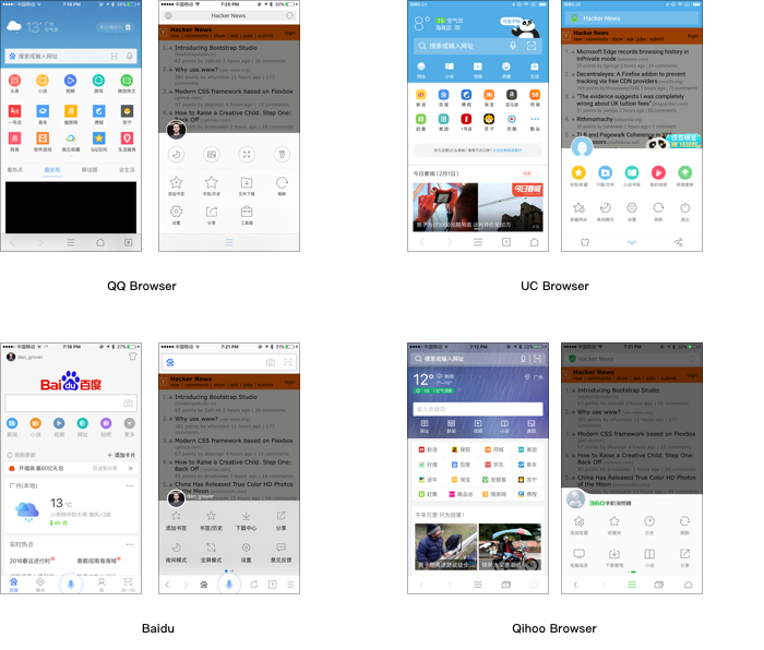
Many people opt out of using the stock browsers on their smartphones, instead opting for a third-party browser like UCBrowser, QQ Browser, or Qihoo’s 360 Browser. In fact, according to QuestMobile, QQ Browser is the 5th most popular app on Android, while iOS users prefer UC, which is the 12th most popular there.
These browsers boast plenty of features above the system browser. They have bandwidth-saving and acceleration features, ad-blocking, theming, “night mode”, scanning/creation of QR codes, downloading of pages and videos for offline use, and of course tight integration with Chinese search, news, and social media sites. Many browsers also offer nice UIs for e-books, usable offline.
Though Baidu’s own browser never took off, its widely-installed main app (mainly a fast way to get to their search engine and portal) holds its own as a third-party browser and includes many of the above features when browsing webpages, not to mention mini-versions of many of their other products (takeout ordering, cloud file storage, news, wallet). Often people reach for Baidu instead of the system browser when their impulse is to navigate to a known website.
Things That Happened in 2015
DATA USAGE BEAN-COUNTING + WIFI AUTHENTICATION GETS EASIER
Folks here are conscious about using their mobile data plans. In fact, according to this report, the average monthly data plan usage here is 210MB (compared to 1GB in the US.)
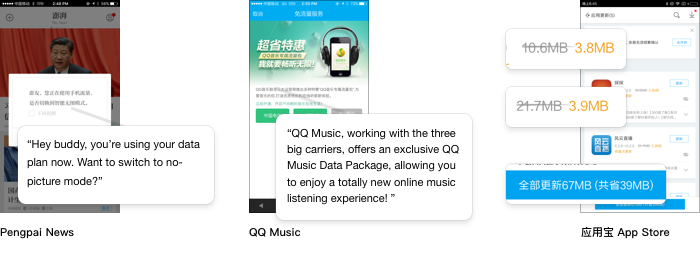
The popular “phone manager” utility apps offered by Tencent and Baidu include features for monitoring and recording your data usage (流量, liúliàng). Many normal apps, too, offer clever ways to lower their data footprint, whether it’s “no picture mode” in news apps and browsers, special data plan offers, or employing special compression.
I mentioned before, too, that most media apps allow downloading content for offline viewing. Thus if I want to binge-watch House of Cards on my next flight home, I can do it with iQIYI, but not Netflix.
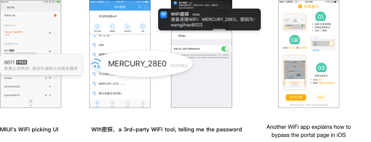
Because people don’t want to waste data, when WiFi is available, they’ll quickly switch to it. All restaurants (except for the lowest-end) provide free wifi to their patrons.
Consequently, there are popular apps for unlocking different networks of hotspots, or for sharing passwords for password-protected hotspots. They even help you guess (hint: it’s usually 88888888). Xiaomi wisely turned Chinese users’ WiFi reliance into a selling point. Their OS’s WiFi connection UI includes badges to tell you which hotspots are known good, free ones, as well as a way to share credentials to a password-protected network with a friend via a QR code. They’ve even got deals with some hotspots to provide free WiFi to people with their hardware.
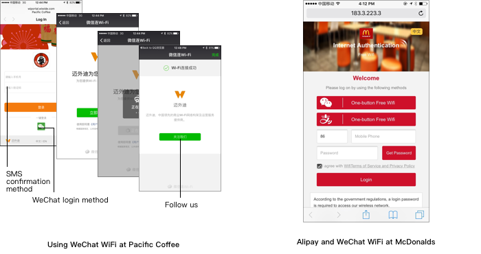
Open hotspots in public places like malls and coffee shops present the user with a captive portal page — you know, when the first page you access is redirected to some other site. In China, these gateway pages almost always require entering your phone number, solving a CAPTCHA, and finally entering the verification code they sent you via SMS. This is due to a law requiring users to provide some kind of “real identity” to all apps, ISPs, and hotspots. A verified cell phone number (which now requires handing over one’s national ID card to get) is thus the most convenient way to do this. I assume it’s so if the Stasi comes to your Starbucks, they can see who’s accessing which cat videos. For hotspot providers, this also lets them keep a handle on people casually leeching their bandwidth.
These pages are inconvenient enough, but when combined with the default behavior on iOS, it’s particularly infuriating. When connecting to a hotspot with a captive portal, iOS will automatically present a sheet with a mini-browser allowing you to complete whatever actions are required to get access. Switching to the Messages app to see the verification code they sent you dismisses the sheet2, disconnecting you and requiring you to go back into Settings, re-connect, and finally enter the code. Finally, after verifying, the sheet’s “Done” button is only enabled via a navigation event, which Javascript-driven portal pages fail to trigger. This is endured daily by hundreds of millions of iPhone users in China who just want their darn WiFi.
This year, a much better solution has been invented and already widely adopted. Now WeChat offers an authentication API for hotspots’ captive portal pages (Alipay also has one). At a restaurant, the customer can even bypass the portal page entirely by scanning a QR code that makes their phone auto-connect and authenticate.
For a typical use case, here’s the sticker they put on all the tables at a Korean BBQ place near me:

Adopting this method of authentication (instead of a plain vanilla router with a password) gives the merchant an opportunity to promote their official account, which is a richer, higher-traffic, and altogether less spammy way to reach users with discounts and news. This also has the advantage of limiting access to patrons physically in scanning distance of the code.
Most hotspots set up like this are WeChat-only, though McDonald’s gives you a choice of WeChat, Alipay, or the old-fashioned SMS method.
FUN WITH CAPTCHAS
Lots of things are protected with CAPTCHAs here, usually the normal sort with jumbled numbers, but sometimes they’re different. Occasionally you’ll be asked to enter Chinese characters or strokes.
A photo CAPTCHA on the official rail ticket booking site 12306.cn (think of it as Healthcare.gov for trains) stumped many users with its nonsensical photo-based challenges and became the subject of Photoshop memes.

THE GREAT TAKEOUT WARS
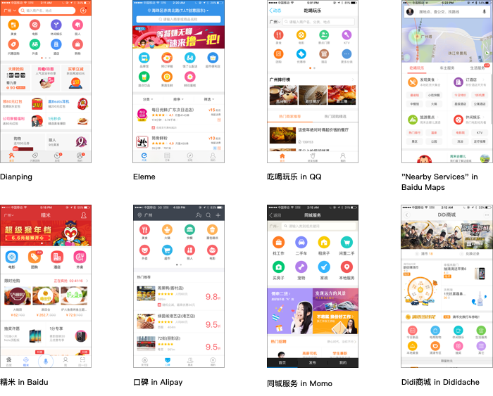
The grandaddy of restaurant-finding apps is Dazhong Dianping, occupying a place similar to Yelp. Yet it seems like every app, no matter its ostensible purpose, has added some sort of “nearby businesses” feature: QQ, Baidu Maps, Momo, Alipay, even Didi Dache. Some have their own take on this feature, others are white-labeled from other apps. Either way, they’ve all decided to present their categories in the exact same way, as two rows of colorful, round pucks with icons on them.
The next step after giving users a fast way to find nearby grub? Make ordering takeout easy!
Aside from Eleme, Meituan, and Dianping, Alibaba and Baidu have also been pushing their own takeout-ordering pretty aggressively. When I walk down the street, I am constantly being handed coupons for ordering takeout via different apps. Some restaurants have had their menus input into the app’s native UIs, while Pizza Hut seems to work in every ordering app using their own UI via a webview.
I like Baidu’s the best, because it has a dorky “status” view showing you updates on your order. I often use it to order from my favorite mala xiang guo hot pot place, or from the local knockoff KFC (which, unlike real KFC, still carries the Mexican Chicken Wrap).
My co-workers like using a service called 连咖啡, available via WeChat, which dispatches a guy to the nearest Starbucks to grab your coffee for you. When I go to Starbucks, I often get stuck behind that guy in line as he rattles off 30 coffee orders from his phone screen and swipes his member card to get the points.
If ordering food weren’t enough, every other kind of service is available via these apps. With one tap, you can summon a maid, a chef, or those big bottles of water for your cooler. I chuckle when I see criticisms of Silicon Valley startups’s lack of ambition tackling problems of sheltered 20-somethings, because China totally has us beat here.
ALIPAY SHAMELESSLY CLONES WECHAT
Here, when making a payment with your phone (on a website or in real life), one has the choice of two main competing “wallets”: Alipay or the Wallet feature in WeChat.
Alipay, strictly built around financial and commerce features, often seems the most straightforward to reach for if you’re buying something at the convenience store or paying the guy who did your drywall. But when it comes to “social” transactions like paying back friends for things and sending festive red envelopes of cash on the holidays, WeChat is the clear choice. Why use something else when they’re already right there?
This year, both apps have tried to bridge that gulf between their respective use-cases to increase their share of online payments. WeChat added a snappy way to send and receive funds via QR code from the front screen without having to first add the counter-party as a friend (or enter Wallet, in the convenience store scenario).
Alipay, for its move, tried something more ambitious. They copied many of WeChat’s chat features, sticking them in a newly-prominent “Friends” tab. It isn’t as if they decided to take inspiration from WeChat and make their product more social — they literally copied it over. The resemblance is beyond uncanny, most screens being pixel-for-pixel identical. The result is a head-scratching attempt at getting people to use a digital wallet app for chatting with their friends, lest they use a chat app to make their online payments.
Interestingly, amid this wholesale copying, they’ve included a unique take on WeChat’s news feed, here called “生活圈“ (shēnghuó quān, life…circle?). Aside from your friends’ posts, you can watch uninterrupted full-screen video snippets from people around you, which is strangely compelling. The first time I opened it, it was fun to see the insides of all the offices of other companies around me and what people there were doing. After that, interest subsided and nobody has posted anything on it ever.
EVERYONE STARTS SELLING FINANCIAL PRODUCTS
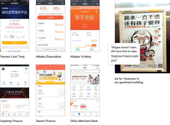
Tencent has been running lots of ads for the re-launch of its financial product marketplace, 理财通 (lǐcái tōng). It’s on the top row of icons in WeChat’s Wallet screen, even above movie tickets and taxi cabs.
One weekend, I just couldn’t escape it. I saw commercials for it before every online video I watched and on the screens in the back of every taxi I rode in. Lest the message not sink in, after the weekend ad blitz, on Monday, these girls posted in front of my office were more than happy to show us how to buy into a fund using the feature:

Indeed, many apps offer 1-click buying of financial products via their wallet features, as do Alipay and the official app from just about any bank. Even Xiaomi ships a “小米金融” app on every device. It’s just a few taps from the main screens of many apps to invest in a fund seemingly yielding upwards of 4% (not long ago, 8%). I see ads for these products everywhere, and they’re always flashy and cartoony rather than trying to seem stodgy and trustworthy like the funds that advertise in the Wall Street Journal.
BOTS
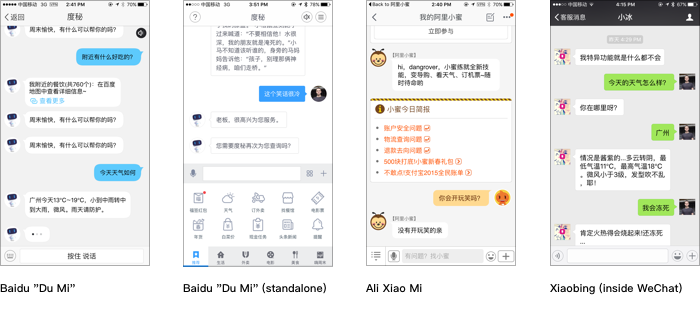
This year, Microsoft China released an AI chatbot called 小冰 (xiǎobīng) that has been popular. She’s accessible via the web, via a standalone app, via WeChat, via Cortana, and through a dedicated button in Xiaomi’s own seldom-used messaging app. It’s fun to toss annoying questions at her and see how she responds. Some people even confide in her. She’s kind of the love child of Siri, ELIZA, and Cleverbot.
A few apps have added bots of their own. The Baidu app has one called 度秘 (dumi, from 秘书, meaning secretary), here represented as an androgynous robot that could be a cousin of Eva from WALL-E. Also available as a stand-alone app, it can answer natural-language search queries, find stuff near you, and tell jokes. It speaks all responses aloud via text-to-speech. Every time you open it, it greets you, instead of just waiting for a query. Though you can type and speak as in a normal chat, they also have a bar at the bottom to expose features and possible responses/follow-ups to something Dumi says.
Inside the Taobao app is 阿里小蜜, (Ali Xiaomi, mi here meaning honey), represented as a cartoon bee. You can install a shortcut on your home screen to go to it directly. It can answer logistics questions about your orders, book travel, and find stuff for you on the site. It cannot tell jokes.
Though bots have been fashionable, I’m not sure there’s evidence that real users actually prefer interacting with apps this way.
THE IOS APP STORE CONTINUES MISSING THE PUCK
This year, a piece of malware called Xcode Ghost infected many popular Chinese apps that had passed Apple’s inspection and been posted on the App Store. It did so via an infected version of Xcode that had been modified to insert the offending malware in every binary it compiled. The infected Xcode had been distributed via Baidu Yunpan, their Dropbox clone.
The reason, of course, that most developers download Xcode from such places is that the official site is really slow. Apple responded by dumping the updates on some CDNs co-located here, but it’s not improved by much.
The App Store is pretty sub-par too, for a few reasons. Not the least of which is that it’s slow all-around, no matter whether you are logged into the US store or the China store. Somehow, it takes about five seconds from tapping the “Search” tab bar icon to the search field actually appearing and becoming usable, which seems like something that shouldn’t be network-bound. Not only is searching by typing keywords something people here do less, but WeChat’s official accounts have already obviated the need for many categories of apps. And when people do install third-party apps, it’s often via QR code, something not supported by the app store or on the OS level.
I’d mentioned in the last post that developers here circumvent the app store on iOS by either having tons of cross-promotion in their own apps, or by actually making their own independent iOS app stores that use OTA certificates to allow installs of non-vetted third-party apps.
In recent iOS updates, Apple made it more complicated for the user to actually authorize these third-party applications. But because the official App Store is so poor, the circumvention has continued un-thwarted. I see lots of links to apps with instructions on how to install this way (like the one for my co-working space).
In fact, just the other day, I was walking down the street and someone handed me this flyer telling me how to enter Settings and trust this certificate so I can play the fish game and win fabulous prizes. What could go wrong?

WECHAT FINALLY BEATS QQ & THE MOBILE FRINGE
In Tencent’s last quarterly statement, WeChat’s monthly active users reached 650 million, surpassing QQ’s 639 million mobile monthly actives. Their total users still beat us, and MAU is not always the most useful metric, but this inflection point happened sooner than anyone had predicted.
Although WeChat has been the darling of the media, it actually has formidable competition in QQ. When it launched as a mobile-only messaging app, it stood in stark contrast to the crusty, still-desktop-centric QQ. The QQ team quickly re-doubled its efforts and successfully pulled off several total redesigns of the app to boost its engagement on mobile devices.
This dynamic is remarkable for two reasons. One is that you’d normally think the younger users would overwhelmingly like the much newer product. But it’s also unusual that a single company could have successfully disrupted itself by creating two, competing, widely-used products in the same category.
As mentioned in a talk by my colleague, there are still hundreds of millions of people who don’t use WeChat. It’s largely younger users and those in more remote parts of the country. Then, of course, there are those who don’t use the Internet at all, or only use it on a desktop. In a country of 1.3 billion, there are only 649 million Internet users, and the actual ratio differs vastly between areas.

I recently traveled to a third-tier city in China’s frigid northeast as part of a team with members responsible for both apps. We were there to conduct some focus groups where we talked to people about how they use their phone, as well as walk around and eat copious amounts of dumplings. I’ve been told there are places here where you buy apps by taking your phone to the village app store and having a guy install it. But going to these sorts of places is more interesting for us because they’re not actually so backwards or remote, yet still quite different from home.
THE WACKY MOBILE FUTURE
Thinking back to when I left San Francisco to move here, my own perspective has shifted. I was afraid that the Bay Area might be the only place I could be happy or do decent work. Aside from my intense longing for burritos, it ended up being a great move. It’s true, there are still some things Silicon Valley is doing well with no contest. Today, China is not yet making the operating systems, frameworks, programming languages, or open standards that the rest of the industry is using.
Yet when I think about it, neither is most of Silicon Valley. As has been ranted about by others, much of the funding and hype back home is all going to people making the exact same sort of consumer apps, gluing together tech to make a buck. Churning out the exact same sort of apps that folks are doing a pretty good job with on this side of the world.
When I’d first moved out and taken a look at mobile design here to write that last piece, it was fun to dive in and chuckle “Hah, some of these apps sure are weird”. It was interesting to see how technology has evolved independently to serve the needs on the ground here.
But it’s about to get a lot weirder. While China is an interesting case, we’ve still got places like India and large parts of Africa that are still far behind. Global internet penetration is still low. And as more people come online in those places, the apps and OSes they use may in no way resemble what we use now. They will look to technology to solve much of the same problems as us while carrying little of the same assumptions.
I can’t wait to see what happens next!
ACKNOWLEDGEMENTS
Thanks to Michael Belfrage, Jeff Dlouhy, and Matt for reading drafts of this post!
FOOTNOTES
-
I’ve only bought stuff this way a few times, but a given with this sort of feature is that buying an item won’t require yet another login or linking yet another credit card, it will use something like Alipay or WeChat Wallet. It is also worth (perhaps in another post) exploring difference in business models of apps here, to which we can attribute the existence of these features. ↩
-
If you’re quick, you can catch it in the push notification banner. But for me, I often mute the numbers that send the confirmation codes because they also send spam that I don’t need push notifications about. ↩

