Bots won't replace apps.
Better apps will replace apps.

Lately, everyone’s talking about “conversational UI.” It’s the next big thing. But the more articles I read on the topic, the more annoyed I get. It’s taken me so long to figure out why!
Conversations, writes WIRED, can do things traditional GUIs can’t. Matt Hartman equates the surge in text-driven apps as a kind of “hidden homescreen”. TechCrunch says “forget apps, now bots take over”. The creator of Fin thinks it’s a new paradigm all apps will move to. Dharmesh Shah wonders whether the rise of conversational UI will be the downfall of designers. Design, says Emmet Connolly at Intercom is a conversation.
Benedict Evans prophecized that the new lay of the land is “all messaging expands until it includes software.”
“People don’t want apps for every single business that you interact with,” says David Marcus, head of Facebook Messenger, “…just have a message within a nicely designed bubble … [that’s a] much nicer experience than an app.” Under his charge, Facebook Messenger has tested this approach, building integrations with high profile partners as well as opening up a bot API.
We’ve even seen avant-garde attempts at taking this idea to its extreme, like Quartz’s latest app, which presents the news as a conversation, or the game Lifeline. Apps like Mailtime even promise to save us from our emails by turning them into chats.
Well!
I guess I might be partially to blame for this, with a few pieces citing a section in a 2014 piece of mine that I literally titled “Chats as Universal UI.”
This recent “bot-mania” is at the confluence of two separate trends. One is agent AIs steadily getting better, as evidenced by Siri and Alexa being things people actually use rather than gimmicks. The other is that the the US somehow still hasn’t got a dominant messaging app and Silicon Valley is trying to learn from the success of Asian messenger apps. This involves a peculiar fixation on how these apps, particularly WeChat, incorporate all sorts of functionality seemingly unrelated to messaging. They come away surprised by just how many differently-shaped pegs fit into this seemingly oddly-shaped hole. The thesis, then, is that users will engage more frequently, deeply, and efficiently with third-party services if they’re presented in a conversational UI instead of a separate native app.
It’s that part which, having spent the past few years working on messaging, seems a major misattribution of what makes messaging apps work and what problems they’re best at solving.
As I’ll explain, messenger apps’ apparent success in fulfilling such a surprising array of tasks does not owe to the triumph of “conversational UI.” What they’ve achieved can be much more instructively framed as an adept exploitation of Silicon Valley phone OS makers’ growing failure to fully serve users’ needs, particularly in other parts of the world. Chat apps have responded by evolving into “meta-platforms.” Many of the platform-like aspects they’ve taken on to plaster over gaps in the OS actually have little to do with the core chat functionality. Not only is “conversational UI” a red herring, but as we look more closely, we’ll even see places where conversational UI has breached its limits and broken down.
But first, let’s retrace how this state of affairs really came about in the first place.
Note: The opinions expressed here are purely my own and do not reflect that of my employer.
A BRIEF HISTORY OF THE CHAT BUBBLE
We’ll begin by taking a closer look at the apparent atomic unit of the “conversational UI”, the message bubble. To do that, we’re going to go back in time a bit. Let’s go back to 2003 or so.
In those days, sending a quick text meant dealing with a UI that looked like this: 
In many phone’s UIs, SMSes were treated like mini-emails, often complete with an inbox, outbox, and drafts. So fussy!
Later, some time in the last decade, perhaps owing to a prototype by Jens Alfke, our IMs began taking on their familiar appearance as cartoon dialog bubbles. When smartphones took off later, it was a natural fit for the system SMS apps on the first versions of iOS and Android.
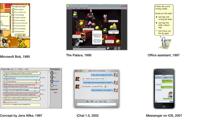
Soon after smartphones launched, those default SMS apps were eclipsed instantly by third-party messaging apps emerging in Europe and Asia (in the US, we have somehow still clung to SMS). They had started as direct clones of the system SMS apps — the only difference being that messages were counted against one’s data quota instead of the stingy and arbitrary SMS allotment given by carriers.
These apps that came along initially to replace SMS have styled the message bubble every way imaginable: round and square, flat and puffy, green and blue. Free from the constraints of a 20-year-old protocol, these apps evolved, taking on more features. The bubbles displayed in these apps developed a number of affordances for new features like read receipts, names in group chats, and more. New kinds of bubbles emerged to accommodate new types of content these apps supported:
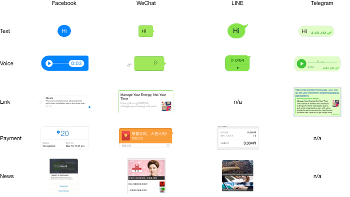
The app I’ve been working on really takes the cake for this. WeChat’s got bubbles for text, voice messages, big videos, l’il “Sight” videos, full-width cards with hero shots for news headlines, bubbles for payments, files, links, locations, and contact cards. Mucking through some code once, I saw definitions for nearly 100 types of supported messages, most I’d never seen in actual use.
Aside from supporting so many different types of messages, another advance WeChat made was realizing a messaging app needed different types of accounts as well. They’d seen brands and celebrities registering personal accounts and making series of giant group chats to invite their fans into. There had to be a better way! Thus was born Official Accounts.
Here’s what one of the first accounts, China Southern Airlines, looked like when the feature launched in 2012:
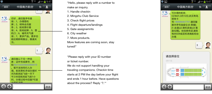
Yeah…this bot ain’t exactly HAL 9000.
Here’s what the account for my city’s subway system looked like:
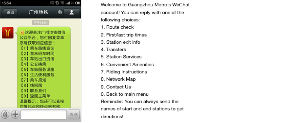
Why was the user asked to enter numbers, as if on an IVR system? Were the creators of these accounts so unimaginative to the possibilities of a new medium as to replicate their old-school hotline?
Actually, no! In fact, keywords could be defined, and messages could be even routed through the third party’s server to formulate a response using whatever method it pleases. Yet in this case, entering keywords or more complex queries in Chinese (or god forbid, formulating a complete sentence) would be even worse. At the time, typing in numbers really was the best UI choice given the constraints.
Critically, these experiences were still often preferable to downloading a separate app on a data plan or spotty WiFi connection, or having to call someone’s customer service hotline and wait on hold. The Official Account platform was a rousing success; there are over 8 million of these accounts today. As it took off, the APIs offered to third parties to build their accounts expanded to accommodate a growing array of use cases and demands.
Some of these new APIs deepened and enabled new possibilities within the “conversational” nature of these interactions. Voice messages were transcribed via speech recognition before being sent to the OA’s server. Objects could be recognized in pictures. Advanced natural language processing could even extract named entities and certain types of queries from text sent by users. Users could be patched in to agents at service centers to carry on a conversation exactly as they would with a friend in the app. There was even a special integration whereby I can select a message in a chat and forward it to Evernote’s Official Account (as I would to a friend) to save it to a note. Cute, right?
On the other hand, far greater and more successful were the enhancements made running counter or orthogonal to the idea of conversational UI.
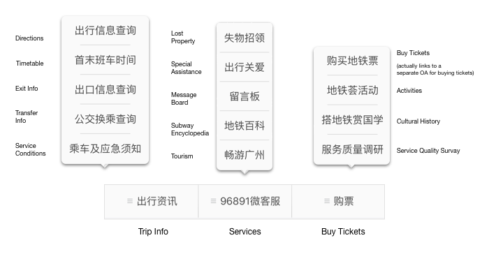
One affordance added right off the bat was the three-tabbed fixed menu. Now accounts could offer fast access to all their features without having to send a prompt or depend on state information. Here’s what the menu looks like today on the Guangzhou Metro’s main official account:
Not only can those tabs send keywords, but they can open up webpages as well. Web apps invoked in this way can identify the user (using OAuth). They even have an extensive JavaScript API at their disposal to integrate with all sorts of features elsewhere in the app, even reacting to Bluetooth beacons.
OAs gained the ability to send and recieve money. The accounts could have QR codes — both for the account itself, as well as parametric ones that can send along extra data (like what product I’ve picked up in a store or what table I’m sitting at). They gained the ability to authenticate me on their owners’ WiFi hotspots (a development that emerged, no doubt, from merchants who had written the welcome message in the OA they made for their shop to tell customers their router’s WiFi password). Official accounts could not only send out headline news to users, but, if they wish, host the linked articles on WeChat itself, letting users add comments and even send cash tips via the app. None of these things have anything at all to do with chat, but they’re darn nifty!
While this craziness was flying around out here, what sort of vision did those disruptors back on the west coast begin conjuring for our future bot overlords? Let’s ponder this example from the homepage of Microsoft’s recently-launched Bot Framework. Here’s how they think we’ll be ordering pizzas in the future:
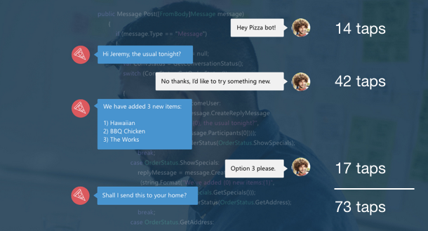
Good gravy, that’s over 73 taps1 to tell Pizza Bot what I want. And this is when he already knows me on a first-name basis! I’d hate to see him when he’s just warming up to someone.
Man, counting those taps sure has made me hungry! We haven’t quite got pizza here, but there’s Pizza Hut, which is almost the same. Let me open their official account…

I have, in 16 taps, ordered a pizza. That includes 1 for choosing ‘medium’, 1 for dismissing their coach marks, and 6 for entering my PIN. For some reason, it’s not set up to use my TouchID. Afterwards, Pizza Hut’s account even sent me a special transaction message with a link to let me track it:
![]()
Well, it isn’t exactly Ray’s, that’s for sure, but it’s pizza. And I didn’t have to leave my chat app to get it.
The key wins for WeChat in the above interaction (compared to a native app) largely came from steamlining away app installation, login, payment, and notifications, optimizations having nothing to do with the conversational metaphor in its UI. These are the steps that generate the most friction in any mobile experence – native app or not.
It shouldn’t require any detailed analysis, then, to point out the patent inanity of these other recent examples of bots and conversational UI proffered by companies on the vanguard of the trend:
This notion of a bot handling the above sorts of tasks is a curious kind of skeumorphism. In the same way that a contact book app (before the flat UI fashion began) may have presented contacts as little cards with drop shadows and ring holes to suggest a Rolodex, conversational UI, too, has applied an analog metaphor to a digital task and brought along details that, in this form, no longer serve any purpose. Things like the small pleasantries in the above exchange like “please” and “thank you”, to asking for various pizza-related choices sequentially and separately (rather than all at once). These vestiges of human conversation no longer provide utility (if anything, they impede the task). I am no more really holding a conversation than my contact book app really is a l’il Rolodex. At the end, a single call to some ordering interface will be made.
Designing the UI for a given task around a purely conversational metaphor makes us surrender the full gamut of choices we’d otherwise have in representing each facet of the task in the UI and how they are arranged spatially and temporaly. Consider those made in Pizza Hut’s acccount: I can see exactly how many slices a medium is, how much corn is inexplicably sprinkled on top of a “Tianfu Beef” pizza, what address it thinks it’s delivering to, and exactly how much it will cost.
So let’s take these past few years in China as “The Great Conversational UI Experiment.” Here, you have a messaging platform that achieved such total saturation among both users and businesses (to an extent that Facebook, Kik, and Telegram would die for). It boldly and earnestly carried the “make every interaction a conversation” torch as far as it could. It added countless features to its APIs — and yet those that actually succeeded in bringing value to users were the ones that peeled back conventions of “conversational” UI. Most instructively, these successes were borne out of watching how users and brands actually used the app and seeking to optimize those cases.
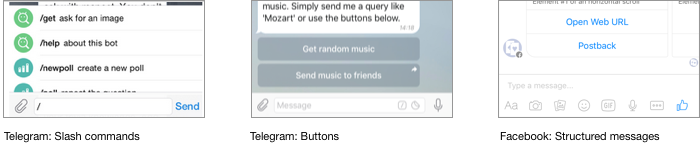
You can see from Facebook and others’ early forays into bots that they’re already beginning to have the same hunch. Telegram’s take is true to its inspiration in IRC-style slash commands.
To be fair, it’s still surprising the range of apps and services that can be shoehorned into a chat-style UI. No doubt it can be expanded with great AI and little UI affordances here and there.
And sure, performing certain tasks in a chat brings along some useful side-benefits. It can be, compared to apps, a low-bandwidth, snappy, and consistent way to get a task done. I’m even left with a handy, timestamped, offline-viewable record of everything that’s transpired. I can search it and quickly jump to media and links. I can clip parts of it and forward it to friends within the app, or save it to an archive.
By interacting with certain services via a messaging app instead of via independent apps, when things happen that might deserve my attention, the thread gets bumped up in my inbox instead the message getting lost in a sea of push notifications and emails.
And though it’s clear pure “conversational UI” is ultimately a failed conceit, that last piece may be more important than it first seems…
THE INBOX IS THE NEW HOME SCREEN
The inbox is where it’s really at. I am, of course, heavily biased, but I feel WeChat’s is the best in class. I’d even go as far as to say it’s an overlooked piece of genius in the app. Some key improvements (compared to the inboxes we’re used to in email and SMS apps) include:
-
Stickyability: If I want to stay on top of a particular thread in the inbox (whether it represents a person, a group, an official account, or another feature exposed here), I can “sticky” the thread to the top of the inbox.
-
Mutability: I can mute notifications from any thread, but it will still pop up in the inbox as any thread does, only with an indeterminate red badge instead of a numbered one.
-
Killablity: If I don’t want to receive messages from something anymore, it’s two taps to kill it.
-
Hierarchy: News and promotions can be pushed to me through official accounts, but when they arrive, they just make the “Subscriptions” category pop up and show me the latest headline without interfering with other messages. When a service has a real reason to send me, personally, a message, it can pop out and appear in the main inbox. I find this approach superior to Gmail’s “sidelining” messages into separate inboxes. 2
-
Status Items: Persistent processes/statuses can be displayed in a special cell at the top. This includes things like being logged into a web/desktop client, using WeChat to authenticate on wifi, playing a song, or migrating data between phones.
-
Searchability: The search bar on the main screen not only searches my contacts but my groups, chat history, favorited content, articles on the web, my newsfeed, and names of features in the app.
It is telling, then, that in all localizations, the name of the first tab in the app is not “Chats” or “Inbox” (as in other messengers), but rather just the name of the app.3
Indeed, the cornerstone of whole experience is effectively a common, semi-hierarchical stream of messages, notifications, and news with a consistent set of controls for handling them. It’s no stretch to see WeChat and its ilk not as SMS replacements but as nascent visions of a mobile OS whose UI paradigm is, rather than rigidly app-centric, thread-centric (and not, strictly speaking, conversation-centric).
When you think about it this way, the things listed there in my inbox don’t need to be conversations per se. But everything there, most abstractly, is something that can send me updates and notifications, will change in position when it does so, retains a read/unread status, and most essentially, allows me, the user, the aforementioned modes of control.
And if we really run with this idea to its extreme, what actually might appear when I tap on a cell in the inbox doesn’t matter — I could see a conversation, a song or video, news headlines, a map showing me my route, a timer, or a sub-group of other such threads. Anything, really. Though I guess it’d be best when it’s at least something dynamic or based on a service (I certainly wouldn’t want to access my calculator or camera this way).
RISE OF THE TORTILLA CHIP APP
This term – “app” – is rather old, yet only entered common parlance with the proliferation of smartphones. This is no coincidence. The app paradigm introduced on smartphone OSes circa 2007 was a radical improvement over what we’d had on the desktop. For the first time, software was easy to install, even easier to delete, and was guaranteed to not totally screw with your system (due to sandboxing/permissions models).
At the time, smartphone apps were envisioned as baby brothers to desktop apps. On iOS, apps like Mail and Calendar were designed to evoke their Mac versions. Apple came out with pocket-sized editions of apps like Pages, GarageBand, and iMovie. For the first few years, setting up an iPhone even required plugging it into a desktop and syncing with that monstrosity known as iTunes.
Though some apps indeed are mini-desktop apps that make full use of the supercomputer I carry in my pocket, well over half fall into another category. These apps are just a vessel for a steady stream of news, notifications, messages, and other timely info ultimately residing in a backend service somewhere. They don’t really do much on their own. It’s much like how a tortilla chip’s main value is not so much in its appeal as a chip but as a cheese and chili delivery mechanism.
The smartphone OS we use are still largely based on the assumption of my phone being a mini-desktop, rather than, well, an information nacho, if you will. Consequently, if you’re making one of these apps, your app must give me something new daily (or more), or else it has no reason to live. Its information would be better shown to me via another app I do check often, like a social news feed or a messaging app. The only recourse the OS affords these apps in avoiding such a fate is the rather blunt instrument of push notifications (and things like Today widgets or Android home screen gadgets).4
THE OTHER WAYS SMARTPHONE OSES ARE FAILING US
After coming to rely on WeChat in China, it can seem a bit like its own separate environment. After all, within it are not only my chats, but my social news feed, my news and blog subscriptions (many only available via the app), my digital wallet, my reading list. It even directly reads my step count from the various Bluetooth devices my friends and I use. It can scan QR codes, something my OS should do, but doesn’t (more on this later). It can recognize songs being played, even books and other objects from photos. And you can pretty easily sling all types of data between these different areas of the app in ways you’d expect.
Sometimes it reminds me of those awkward transitional days in the early 90’s when one might launch Windows or other shell environments from DOS, then occasionally drop back out to do other stuff. That’s what switching out of WeChat, to my homescreen, and into other apps is slowly heading towards.
It should be no surprise, then, that I say it feels like my OS just isn’t doing much for me lately. How is that? These days, a smartphone OS’s job, aside from the low-level drudgery we take for granted (managing memory and thread pools and the like), is to provide some common infrastructure and higher-level services that apps can rely on. So that apps can focus on doing what they do best. And in this area, it seems OSes are falling short of their potential.
Each item below seems like a petty, inconsequential annoyance — to the point where I feel like some kind of strange, cranky, millenial version of Andy Rooney for even writing it — but they quickly add up!

Notifications — When I glance at my homescreen, there’s red dots splattered everywhere. My eyes dart first towards a few I can interpret. WeChat, naturally, then Mail. My inboxes have 8,108 unread messages, but I surely would notice if it changed to 8,109.
My “Social” folder has 4, one from Facebook which I will check, and three from other stray apps displaying “1”s. I’m not sure what those apps are telling me, or what I’ll need to do after opening the app to clear the dot. I think one might be from when my friend checked me in on Foursquare at a bar a few weeks ago on a trip back to SF, a fact I was aware of because I was standing next to him when he did it, and because the notification already appeared on my phone then. Another might be Instagram, which just throws up a red badge from time to time when it feels lonely. But I mainly know that if my “Social” folder is displaying a 3, there’s probably nothing to see, and a 4 or a 5 may deserve checking.
The system Messages app, which I still keep on my home screen, is showing 39 unreads, mostly one-time-passwords, transaction notifications from my bank, and spam. Messages, for most here, serves no other purpose. My “News” folder displays the sum of a few apps that are trying to tell me something. Airpocalypse is displaying the current AQI of 93 for Guangzhou in its badge.
Starbucks has a ‘1’. What’s that? Have I got a free coffee credit to redeem? Possibly a scone? Let’s see. No, it’s an unread message within the app’s own inbox saying “Welcome to the Starbucks App!” from 43 days ago. Christ on a crutch.
Even worse than those notifications gazing at me longingly from my homescreen are those that interrupt me. When I install a new app, I’m usually prompted right-off-the-bat to enable notifications for it. I’m taking a risk in doing so, not knowing how often or for what they’ll be sent. When I’m interrupted by a superflous notification on my iPhone (or worse, on my Apple Watch), there’s no quick way to tell it “Shut up, and never bother me with this sort of thing again.” I must fish through Settings, find the app, and tweak it there. It is often easier to delete the app entirely. MIUI and some other flavors of Android at least allow me to mute a given app’s notifications right after seeing one. Many apps offer settings to specifiy what sort of things merit notifications, but they’re often located in different places and not worth the trouble.
On iOS, if I miss a critical notification on the lock screen because I actually wanted to unlock my phone to make a call or look something up, until recently, there was no way to quickly go back and find what it was. iOS 9’s notifications drawer, like Android’s, now defaults to sorting notifications reverse-chronologically, instead of grouped by app — an advance five years in the making.
Lastly, things become even more clunky across multiple devices. When I get home from work and crack open my personal laptop, I am notified a second time of all the Facebook messages I recieved during the past couple days, all of the LinkedIn invitations I already saw (because they sent me an email and another push on my phone), and all of my friends’ birthdays.
QR Codes — When I left the US, QR codes were a joke. Printing them on things was a way to tell people you’re a douche, like using lots of hashtags or wearing a Bluetooth headset. They were once this way in China, too, until WeChat doubled down on them. Now, they’re used for people, group chats, brands, payments, login, and more. They’re in plenty of other apps as well. In a place where everyone has adopted them and knows how to scan them, they’ve become a wonderful, fast way to link the offline and online worlds that saves untold amounts of time. But they have a few downsides. One is that they look like robot barf. The other is that, at least here, if you scan a code in the wrong app, you’ll get a webpage telling you to go install the right app, if not something totally inscrutable. Something that was once defined as an open standard is now non-inoperable. I predict great things for Facebook and Snapchat’s de-uglified take on QR codes. Still, I wish my phone’s OS could scan any such code (or detect them in photos) and do the right thing, but it seems the window of opportunity has passed for this.
App Distribution — Aside from the obvious gripes — the app store’s poor discovery mechanisms and inconsistent approval process — I’d written an aside in my last piece about the ways iOS’s App Store misses the mark in China. In short, it’s dog slow and doesn’t support QR codes (which appear in every app advertisement here).
Apps Are Too Big — Not to mention, apps are just too darn big these days. Twitter, an app that displays 140 character messages, weighs in at 72 MB. Bigger apps are less likely to be downloaded on data plans, or even on bad wifi connections. And much more likely to be deleted, forcing users to go through the setup process again every time they re-install them. Apple’s tried to solve this problem via app thinning and on-demand resources, but it hasn’t seemed to make a difference yet. David Smith astutely summed up the issue in his post “16GB is a bad experience”, and, I would add, this experience is one disproportionately had by mobile users in the developing world.
Contacts & Social Graph — The idea behind the Contacts app (beyond giving me a way to tag phone numbers with names) is to act as a central repository where a single entry for a person can be linked to every kind of phone number, address, or ID I know for them. iOS’s version has roots in the Address Book in OS X and NeXTStep. In theory, I should be able invoke it in an app to store or retrieve a person’s info for the task at hand, rather than maintaining the same contacts in a bunch of separate app-specific databases. In practice, well, it doesn’t really work that way. The concept of a person as they exist in Facebook or WeChat is rather disjointed from their profile elsewhere.
Not only this, but adding people could be far better. Something clicked in my mind the first time I met a cute girl and she asked to scan my QR code (rather than type in my phone number or search for me on Facebook). Once I got in the habit of adding just-met friends and colleagues via QR code (or Bluetooth) I never wanted to add someone any other way. Why can’t I pull out my phone and, with a swipe from the lock screen, add someone I’ve just met to my phone’s contacts, with whatever phone numbers, websites, or messaging app usernames they’ve chosen to expose to me?
Connectivity — I wrote before about how apps here get around people’s reluctance to use their data plans. I’d mentioned WeChat, Alipay, and Xiaomi’s attempts to make their WiFi-dependant users’ lives easier. This is as big a problem in China as it is in many other developing countries. It’s an issue the OS could address more directly, whether it’s improving the process for authenticating on public hotspots or giving me better ways to monitor my usage.
Authentication — When I open most apps for the first time, they either make me sign up for a new account with my email, use Facebook or other third-party services to log in, or, as is increasingly common, use my phone number to send me a one-time password. These are super clunky. Apps should be already logged in the first time I open them. There should be some flexible concept of identity that the OS can provide to apps immediately without asking, and then, with permission, supplement with further details. If users must switch identities, maybe a Mozilla Persona-like system could be adopted. Anything would be better than the mess that is app login now.
Data Interop — My apps are terrible at sharing data. Lots of friends send me screenshots of articles, chats, tweets, even other apps as a way to share the underlying information. It’s particularly annoying when compression artifacts make the text illegible or I want to go read the rest of the article or engage with the thing in the screenshot somehow. If I open a page in Facebook and want to share it in Twitter, I have to choose “Open in Safari”, re-load the page, and do it from there (though Facebook clearly knows exactly what they’re doing in that instance.) I wish the data in my apps was more atomic and could be freely shared, persisted offline, and searched in a consistent way. But this sort of thing has been a pipe dream since OpenDoc and OLE, so maybe it’s just one of those things you should never do.
Offline Storage & Storage Management — As a consequence of people being so reluctant to use their data plans, apps here are big on offline storage. All the music and movie apps do it, as do news apps and the third-party browsers popular here. Some give users detailed interfaces to manage their storage, even showing little pie graphs. I like this level of control, and I wish all my apps had it. I’d prefer not to think about storage, but if I have to clear data, I’d rather do it from a central UI rather than going into each individual app to manage the things it has saved (or deleting the app out of frustration).
Payments — I wrote before about how nifty online payments are in China. Any website or app that takes my money pretty much uses Alipay or WeChat Wallet. In the US, I have to type in and update credit card and address info for every new app I install. We have OS-provided solutions in Apple Pay and Android Pay, but these seem to be accepted in few places and strictly NFC-based, limiting potential network effects. The nice thing about the solutions here is just how many combinations of scenarios and hardware they’ve covered, whether it’s expensive POS equipment that just requires me to hold my phone up, to scanning a pre-generated QR code the merchant has printed on a vinyl mat, to web payments, to 3rd-party app payments, to peer to peer payments between normal users who aren’t connected. Whether you’re an app startup or a mom and pop convenience store, you have no excuse to not accept one of these solutions. And as a user, there’s no place where it’s more frictionless to part with your money. When will blowing my hard-earned dough in US apps be this easy?
THE COMING META-PLATFORM WAR
So the meta-platforms — WeChat, Facebook, LINE, and the like — have come and addressed many of the pain points above. They’ve delivered solutions neither the open web nor those behind the closed app store model were coordinated enough, thoughtful enough, or perhaps incentivized enough to produce.
Originally, the whole tradeoff we were promised with locked-down devices and app stores was that things were much nicer inside the “walled garden.” But over the years, as so many weeds sprung there, others came and built another wall with another garden inside of it, with yet another gatekeeper to deal with.
In the 1990’s, OS makers shook in their boots over the prospect of web browsers disintermediating them, but somehow it’s taken more than another decade for the next challenger to emerge in the peculiar form of messaging apps. And though they’re still quite far from wholly replacing the high-level features OS offer to users and app developers, we can clearly see the beginning of this encroachment.
So here we are. What do we do?
A LITTLE LESS CONVERSATION, A LITTLE MORE ACTION
I don’t know about you, but here’s what I want to see happen.
I want the first tab of my OS’s home screen to be a central inbox half as good as my chat app’s inbox. It want it to incorporate all my messengers, emails, news subscriptions, and notifications and give me as great a degree of control in managing it. No more red dots spattered everywhere, no swiping up to see missed notifications. Make them a bit richer and better-integrated with their originating apps. Make them expire and sync between my devices as appropriate. Just fan it all out in front of me and give me a few simple ways to tame them. I’ll spend most of my day on that page, and when I need to go launch Calculator or Infinity Blade, I’ll swipe over. Serve me a tasty info burrito as my main course instead of a series of nachos.
The next time I’m back stateside, I want my phone to support something like Chrome Apps, but retaining a few useful properties of apps instead of being big, weird icons that just link to websites. I want to sit down at T.G.I Friday’s4 and scan a QR code at my restaurant table and be able to connect to their WiFi, order, and pay. Without having to download a big app over my data plan, set up an account, and link a card when it is installed. Imagine if I could also register at the hospital or DMV in this fashion. Or buy a movie ticket. Or check in for a flight.
As a user, I want my apps — whether they’re native or web-based pseudo-apps — to have some consistent concept of identity, payments, offline storage, and data sharing. I want to be able to quickly add someone in person or from their website to my contacts. The next time I do a startup, I want to spend my time specializing in solving a specific problem for my users, not getting them over the above general hurdles.
I don’t actually care how it happens. Maybe the OS makers will up their game. Maybe Facebook, Telegram, or Snapchat can solve these problems for me by bolting solutions onto their messaging products. Hell, maybe Chrome or UC Browser will do it. Or maybe it’ll be delivered in some magic, blockchain-distributed, GNU-licensed, neckbeard-encrusted solution that the masses, in a sudden epiphany, repent to.
But more than anything, rather than screwing around with bots, I want the tech industry to focus on solving these major annoyances and handling some of the common use cases I described that my phone ought to do better with by now.
SEE ALSO
If this is the first essay you’ve read that exposed you to the wacky and wonderful world of Chinese software, you may enjoy my 2014 summary on the topic and its 2016 followup.
ACKNOWLEDGEMENTS
Thanks to Kevin Shimota, Jeff Dlouhy, Andrew Badr, Jon Russel, Muzzammil Zaveri, Sonya Mann, Stephen Wang, Hank Horkoff, Mark Evans, Michael Belfrage, and Jake Rozin for reviewing drafts of this essay.
FOOTNOTES
-
One might object to the tap-counting approach above with “but what about speech recognition? Why can’t it be like Jarvis in Iron Man?” First, you are not Tony Stark. Second, speech recognition UIs are only economical for a given task when describing the task orally is faster than the equivalent tapping. I’ve only ever had one use-case for Siri: when I’m leaving the laundromat and tell her “Set a timer for 35 minutes” so that I can come back to put my clothes in the dryer. That is to say, it takes longer to set a timer than it takes to utter the words “set a timer.” Performing complex, multi-choice tasks like ordering a pizza with only a speech UI would take several multiples of the time it takes to do them using a well-optimized conventional UI as we’ve seen above (particularly if I’m waiting for a synthesized voice to rattle off the response each time). In conversations longer than a single commmand, using such UIs can feel less like being Iron Man and more like speaking to the sloths in Zootopia. The only case I see them being useful is when I’m not able to use my hands. ↩
-
I’ve been wanting to pitch a feature that lets users to put any thread into folders. This would let users tame their growing number of group chats, decide which ones should have priority in their stream, as well as make it harder to lose track of them. I fear it would be too complex though. ↩
-
Since publishing this article, WeChat’s English localization has reverted its inbox tab to say “Chats”, while in Chinese, it remains the name of the app. ↩
-
There are actually a few decent choices for presenting timely info snippets from disparate sources/apps. You could choose a conventional inbox, a modern chat app-style inbox as described here, dashboard widgets/tiles (as in Windows’ Metro-style UI), Facebook-style filtered newsfeeds, unfiltered Twitter-style feeds, or Google Now-style cards. But I think the chat-style inbox as detailed here is the most versatile. ↩ ↩2